AI Art Styles Explained: From Watercolor to Cyberpunk
A field guide to the style families that steer AI image models, which ones suit which subjects, and how to mix them without making a mess.
 Bylo AI Team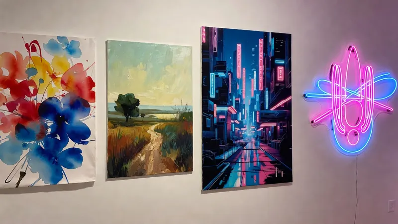
One word can change everything. Add watercolor to a prompt and the model changes its palette, its edges, its contrast, and its level of detail all at once. Style words are shortcuts that flip a whole set of decisions. Understanding the families they belong to makes your prompts shorter and your results far more predictable.
Why a single word does so much
A style word is not a filter applied at the end. It is a signal about the entire rendering process: how much texture to keep, where to draw lines, how saturated to be, and how much fine detail to include. Because the model has seen thousands of examples of each style label, one accurate word carries more information than a paragraph of vague description.
The five families
Painterly — traditional media that shows its hand. Watercolor, oil paint, ink wash, gouache. Visible brush or wash texture, soft edges, colors that blend into each other. Best for landscapes, flowers, and quiet scenes.
Illustrative — drawn rather than painted. Line art, flat vector, comic panels, anime. Defined outlines, simplified shading, often bolder color. Best for characters, icons, and editorial illustrations.
Photographic — rendered through a camera. Film grain, studio editorial, documentary, vintage snapshot. Realistic light and material, controlled depth of field. Best for portraits, products, and anything that must stay believable.
Rendered — built in 3D. Glossy 3D renders, clay, isometric, paper cut. Recognizable geometry, clean surfaces, playful proportions. Best for products, architecture, and explanatory visuals.
Digital futuristic — electronic and speculative. Cyberpunk, vaporwave, sci-fi concept art, glitch. Strong color contrast, artificial light sources, urban density. Best for night scenes, tech subjects, and album artwork.
Which family suits which subject
- Portraits. Photographic or painterly. Illustration flattens the face, which can be flattering or unflattering depending on the person.
- Landscapes. Painterly is the strongest choice. Rendering and photography both struggle when the scene is already visually complex.
- Products. Photographic and rendered. Both preserve material honesty.
- Pets. Illustrative and rendered work well. Fur survives simplification better than skin.
- Interiors and architecture. Rendered for clarity, photographic for warmth.
- Food. Photographic. Anything stylized starts to look unappetizing.
Mixing without making a mess
- Pick one primary and one accent. A painterly base with a photographic lighting note works. Two competing media words do not.
- Keep the palette consistent. A muted watercolor palette conflicts with a neon cyberpunk palette; choose one and let the other element submit.
- Stop at two. Three style words fight for control and the output becomes muddy.
- Change one word at a time. If you add a style and the result gets worse, you know exactly what caused it.
Building a personal style
Consistency comes from a short list of phrases you reuse. Keep a note of the fragments that reliably produce the look you want — a palette phrase, a light phrase, and a medium phrase is enough to establish a recognizable signature. Reuse them instead of starting from nothing each time.
Common mistakes
- Contradictory media. Asking for a crisp 3D render in a loose watercolor style.
- Style fighting the subject. Cyberpunk over a photo of a sunny garden reads as accidental.
- Relying on one overused look. The style does all the work and the image says nothing.
- Expecting a style word to fix composition. It cannot. Framing is a separate decision you make before generating.
A note on respect
Styles are a shared human language, but specific characters, logos, and the work of living artists are protected. Describe a style with ordinary descriptive words rather than naming an artist as an imitation target, keep personal experiments personal, and do not present generated images as the work of any real studio or creator.
Next steps
Take one subject you photograph often, and generate it in three different families — painterly, photographic, and rendered. The comparison teaches you more about how style words behave than any list can. You can run all three in one session on Bylo AI and keep the strongest in your history.