The Hand-Painted Animation Look: What It Is and How to Make It
The soft watercolor, gentle light, and nostalgic scenery behind the hand-drawn animation style, plus the prompt ingredients that reproduce it.
 Bylo AI Team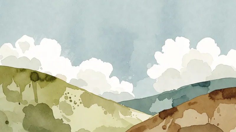
Few looks are as instantly recognizable as the hand-painted animation style: wide skies, layered green hills, warm soft light, and faces drawn with a few confident lines. It is a style built on restraint — most of its charm comes from what is left out. This piece covers what defines it, which photos convert well, and which words actually reproduce it.
What defines the look
- Soft watercolor and gouache texture. Color applied in gentle, slightly uneven washes rather than flat digital fills.
- Muted but warm palettes. Dusty greens, cream, faded blue, and a touch of ochre.
- Generous skies and clouds. Cloudscapes are practically a signature of the style.
- Layered natural scenery. Hills, fields, trees, and distant horizons stacked in planes.
- Simple expressive faces. Two dots, a small mouth, and posture that carries the emotion.
- A hand-painted background feel. Slight texture in the paint, not photoreal detail.
Why it appeals
It reads as calm. Photographic filters can change color and contrast, but they cannot turn a parking lot into a meadow at dusk. This style reframes the scene rather than grading it, which is why it produces nostalgia rather than just a moodier version of the original.
Which sources convert best
- Wide landscapes, especially rural, coastal, or mountainous scenes.
- Couples and families photographed in soft natural light.
- Pets, particularly against greenery.
- Travel photos with a clear subject and an open sky.
- City scenes from a distance or across water, where the geometry is simple.
Scenes that fail are the opposite: tight interior shots, cluttered streets, and photos where the subject is small against busy texture.
Prompt ingredients that produce it
Group the words by what they control:
- Medium and texture. Hand-painted watercolor, gouache, visible brush texture, soft paper grain.
- Palette and light. Muted warm palette, soft diffused daylight, gentle golden hour, low contrast.
- Scenery and setting. Rolling hills, open meadow, layered distant trees, wide cloudy sky.
- Rendering notes. Clean line work on faces, soft shadows, detailed background, no harsh contrast.
Two or three words from each group is usually enough. Adding five words from the same group tends to cancel them out.
Variations worth trying
- Watercolor storybook. Cooler palette, softer edges, gentle and quiet. Best for couples and children.
- Gouache countryside. Denser color, stronger greens, more visible texture. Best for landscapes.
- Soft nostalgic summer. Warm, hazy, slightly faded. Best for travel and childhood memories.
- Dusk lantern scene. Blue hour palette with warm points of light. Best for streets and interiors at night.
Editing a photo versus generating from scratch
Converting an existing photo keeps the composition you already like, which is usually the right choice for a personal memory. Generating from a written prompt gives you more control over scenery and mood, and works better for imaginary places. If you convert, check that the original subject is still recognizable — the point of using your own photo is that it is your photo.
Common pitfalls
- Over-detailed faces. Detail fights the style. Force simplicity.
- Oversaturated greens. A little dirt in the palette is what makes it read as painted.
- Cluttered foregrounds. The style needs open space to breathe.
- Losing the subject. If the scenery swallows the person, reduce the landscape language and describe the subject more precisely.
Respectful use
This look is often described informally as Ghibli-style, after the well-known Japanese animation studio, but it is a stylistic homage and nothing more. Bylo AI is not affiliated with or endorsed by that studio or any other rights holder. Do not use character names, film titles, or logos, keep such images personal and non-commercial, and do not present the output as official artwork.
Next steps
Take one landscape photo with an open sky and run it through two variations — a watercolor storybook pass and a gouache countryside pass — then compare which one suits the memory better. You can run both in one session on Bylo AI and keep the better version in your history.